Branding
An identity that still reads at 16 pixels, in a row of partner logos and in a script you do not write.
An NGO’s mark lives in hard places: a browser tab, an app icon, the fifth logo in a row on a partner’s report, a banner printed in a language the designer does not read. Most marks are drawn for a cover page and fail everywhere else. The Collective Service’s old logo stopped working below about 100 pixels wide.
We design identity systems for organisations, programmes and campaigns, and we test them where they will be used. The mark is drawn to hold at 16 pixels and to sit in a row of partner logos without losing itself. The palette gives each colour a job, so that body text meets 4.5:1 and the colours you are known for are kept for display. The typography is chosen across the languages you publish in, including Arabic, Chinese and Cyrillic, so a translated page still looks like you.
What you receive is a set of guidelines that partners and country offices apply without us: rules for colour, clear space, minimum size and type, with the contrast table included, so the next campaign page looks like the organisation without a call to the studio.
What you get
Mark
Drawn to be legible at 16 pixels and in a row of partner logos, with rules for clear space and minimum size.
Palette
Each colour given a job: text, display, fill or decoration, with every pairing measured against 4.5:1 and 3:1.
Typography
Typefaces chosen for the scripts you publish in, with sizes and weights that hold across them.
Guidelines
Published as a page partners can open anywhere, with the contrast table included, so it does not go out of date in a drawer.
Rollout
Templates for the pages and documents you produce most, so the identity is applied the same way by everyone.
Fees
A website and brand from CHF 60,000, fixed to scope and invoiced in Swiss francs. An identity on its own, for a programme or a campaign, is priced in the proposal from your brief. All fees →
On the record
- A proposed mark legible at 16 pixels (The Collective Service, shared with the partnership’s permission)
- Our own six-colour palette: body text at 7.23:1 or better, brand colours kept for display
- Guidelines with colour, clear space and minimum size
From the work
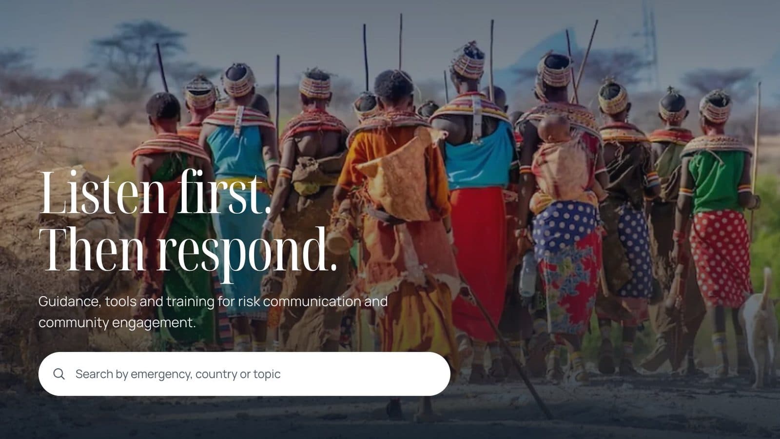
The Collective Service
Partnership · 2026 · A proposed identity for separate organisations acting as one service, legible at 16 pixels.
Read the case study →Questions we are asked
We cannot change our logo. Can you still help?
Yes. Most palettes do not fail; particular pairings fail. We keep the mark, give each colour a job and write the table into your guidelines. How that works →
Who owns the identity?
You do. The source files and the guidelines are yours at launch, with no licence back to us.
Will it work in Arabic?
Yes, and you will see it in Arabic before you approve it. Every identity is set in the scripts you publish in, including right-to-left.
Contact
Send us the brief.
A rough brief or a terms of reference is enough. Matthew Bowman replies the same business day, and you have a fixed-fee proposal within five working days.